
The Original Elfquest
It is impossible to overstate how important this series was to me during the ’80s. If you want to understand teenage me, Star Trek, Robotech, Elfquest, and role playing games are essential knowledge.
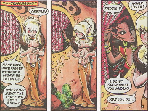
I recently picked up the Dark Horse collection of the series and read through it for the first time in entirely too long. Mostly, this is long-familiar ground. The Wolfriders are elves, persecuted by humans for generations, and then burned out of their home. After an introductory story, the titular quest begins as Cutter, youthful chief of the Wolfriders sets to to understand more of the world, and what, if any, place they may have in it. As our knowledge of this nameless world with two moons (which has since been named the World of Two Moons…) expands, so does the scope of the story, ramping up from thoughtful beginnings to an action-packed epic fantasy climax, and finally, unexpected answers.
This was the kick-start of the independent comics boom of the ’80s (along with Cerebus), and parts of it are rooted in its time. Narration text boxes are heavy and sometimes weigh down the storytelling (though on occasion they do heavy lifting to keep the page and art from getting tied up in talking heads). And parts are ahead of their time, with Wendy Pini’s art being an early source of Japanese manga influence in the US. On top of that, there is a great story, with great art that also shows her animation training, as characters have life on every page.
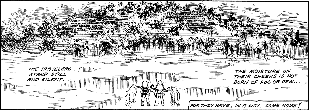
Reading it was also new to me as the Dark Horse version is in the original black-and-white. Wendy Pini’s inks are gorgeous, and it’s great to see them here. But the World of Two Moons is a colorful place, and one where color can be very important. The original series has been colorized three or four times, and the best of those colors is how I first discovered the series, and the version that is both the hardest to find now, and what I would have hoped for others to see in the Dark Horse version.
The worst color version is the 1985 Epic Comics reprint. This was produced in the usual (for the time) comics standards which means it would have suffered from lackluster registration and a very coarse color screen no mater what, but it also suffered from a non-technical problem. Glynis Oliver did the colors for the series, and while she is generally good and celebrated colorist, for some reason the trolls, who should have a kind of an olive drab skin tone kept coming out with regular human(/elf) pink skin tones. And it was a recurrent problem that would go away and come back. I don’t know what happened there, but it’s solidly the worst.
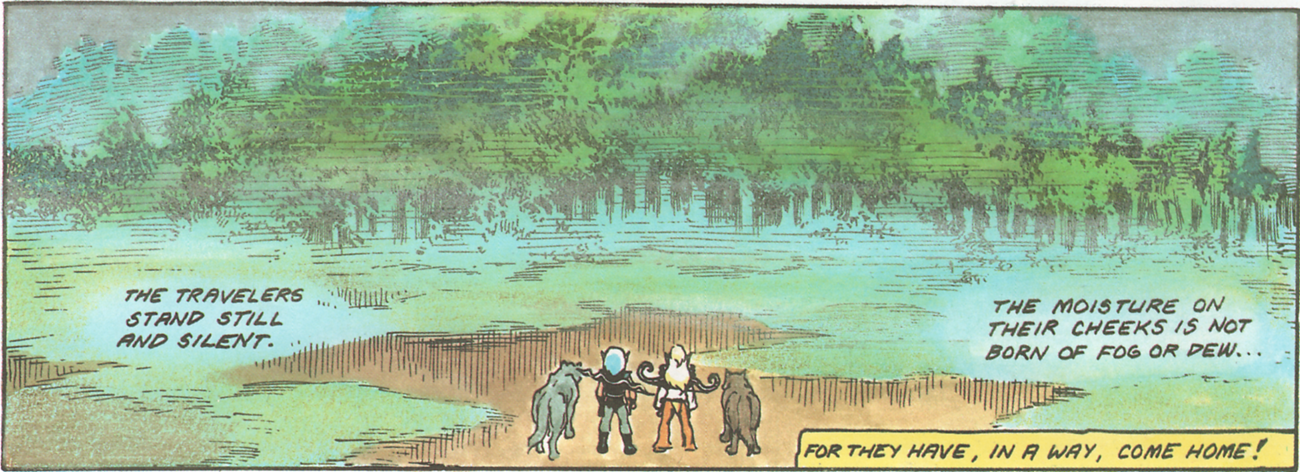
Next up is the Father Tree Press graphic novels from 1988. The printing job is fine, and the colors are actually very good, but a bit flat. I think this was produced by the traditional color-guide and separation method of comics. For that, it’s very good. At least in the original series. The graphic novels after that, where there were no previous color jobs to act as a guide, get worse with some odd color/highlighting choices, and some garish results. I know very little of the 2003 DC release, but it has computer color obviously based on the Father Tree Press versions. What little I’ve seen does have some very nice effects.
The first, best, now lost, colors were in the 1981-84 Donning/Starblaze graphic novels. These were hand-painted over prints of the original pages and then photographed. Wendy Pini did a very good job with the first volume and 2-4 were even better with Jane Fancher doing the colors (the first Dark Horse volume is all four of the Donning books together). Given that the relationship between the Pinis (and many other creators) and Donning ended in court, I have to assume that Donning owned the rights to the color work, which is why it’s never been re-used.
And it is a shame. Compare the B&W, Father Tree, and Donning versions here:
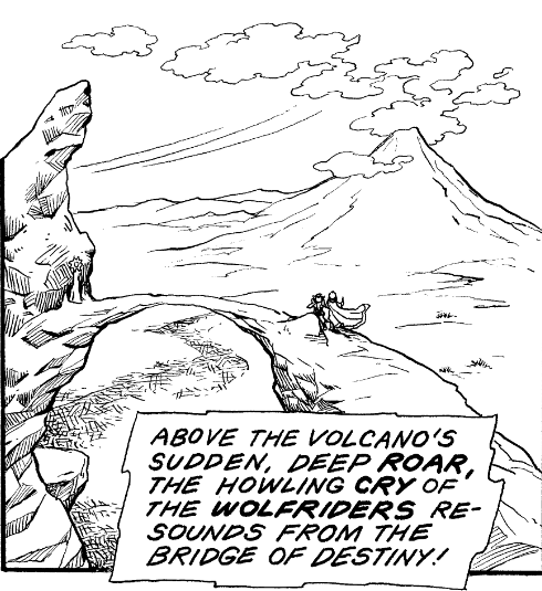 |
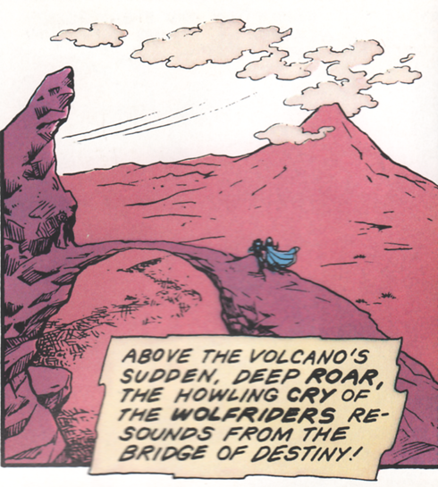 |
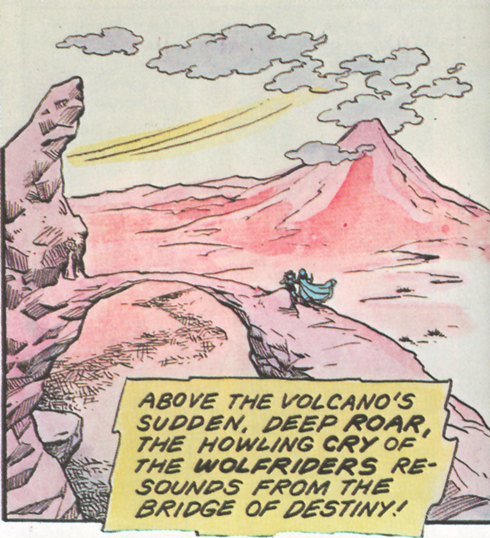 |
Or just the two color versions:
 |
 |
And a glimpse of Fancher’s colors:
 |
 |
Dark Horse’s collection seems to be meant to preserve the original. It sticks with the original black-and-white, and foregoes the extra pages from the Epic series that were inserted into the Father Tree Press version. It’s still missing a bit, as originally there were twenty color front and back covers to give a much better guide to how everyone looked, but preserving the original presentation is worthwhile in its own right.
And color or not. Or any of the various color jobs, it is still a very good story well worth a read or a dozen.
Discussion ¬